Interactive Supply Chain Demonstrator
Design project involving the development of a public interface for a 55-inch touchscreen to demonstrate the company’s supply chain (SC) management software.
Project Type
Research internship in partnership with a technology consulting firm
Team
4 industry experts + 3 SC consultants
Duration
8 weeks
Role
I was responsible for designing the information architecture, UX flow and UI of the system. I led the process of wireframing, interactive prototyping, and unit testing before handing off the finished product for development.
The Challenge
Our stakeholders needed a way to advertise their supply chain management software in-house in order to add new business clients, as well as encourage individual visitors to sign up for SC networking events. These individuals were not experts in supply chain management, so concepts needed to be communicated in a clear and engaging manner. They wanted to achieve this with a large interactive digital display, sitting in a reception area.
The project was subject to several technical and resource constraints. Firstly, the project lasted 8 weeks and I was the sole UX designer, limiting the extent to which detailed user research and evaluation could be carried out. The interface was to be displayed on a 55’’ touch-screen, so UI elements had to be positioned and scaled appropriately for this form factor. Ergonomics and touch-screen interactions also had to be configured appropriately, since users would navigate the display while standing. Lastly, we were limited in our choice of prototyping software due to a lack of acquired licenses; this imposed constraints on the visual fidelity of the final design.
The Solution
I had meetings with stakeholders to determine the key content to appear on the display; I grouped this into pages and sup-pages, as per the sitemap on the left.
I conducted parallel prototyping - exploring design alternatives through paper sketches of each page, focusing on visual organisation of content and navigation.
Designs A and B were mocked up on proto.io to be concept tested with the stakeholders - we chose A as it was more suitable for the touch screen.
UI design focused on ensuring that the colours and iconography were brand appropriate as well as visually engaging.
Final Prototype

Image 1 of 7 on the sliding carousel home page. Clicking anywhere on the image leads to the "principles" page.

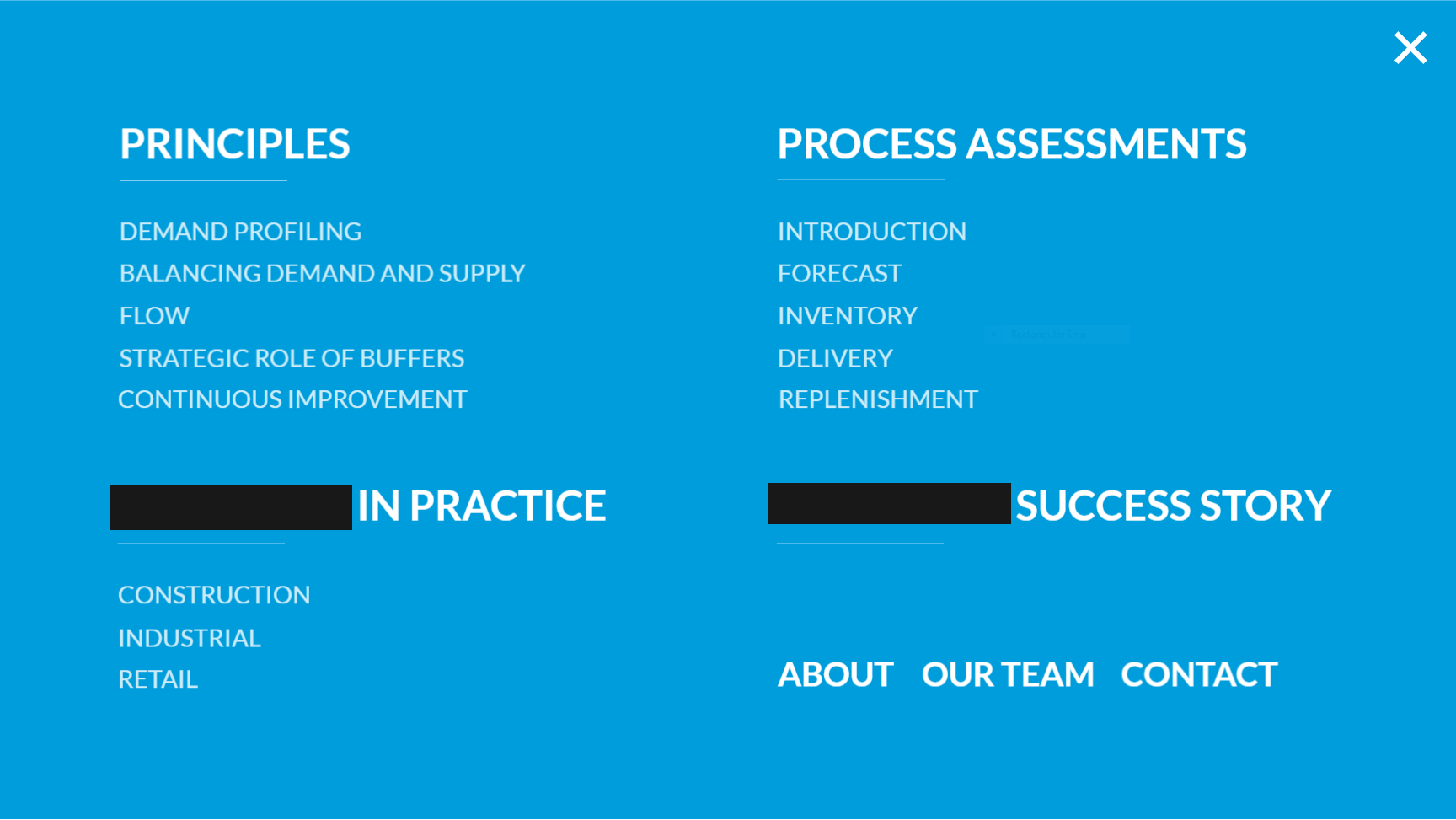
Full screen menu reached from hamburger icon on any screen.

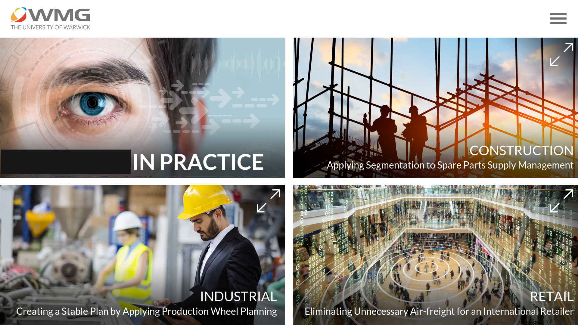
Overview of case studies - clicking on any individual picture or the expansion arrows opens the relevant subpages.

First screen of case study sub-page - clicking down arrows skips directly to that section, else the user scrolls down sequentially by swiping up.

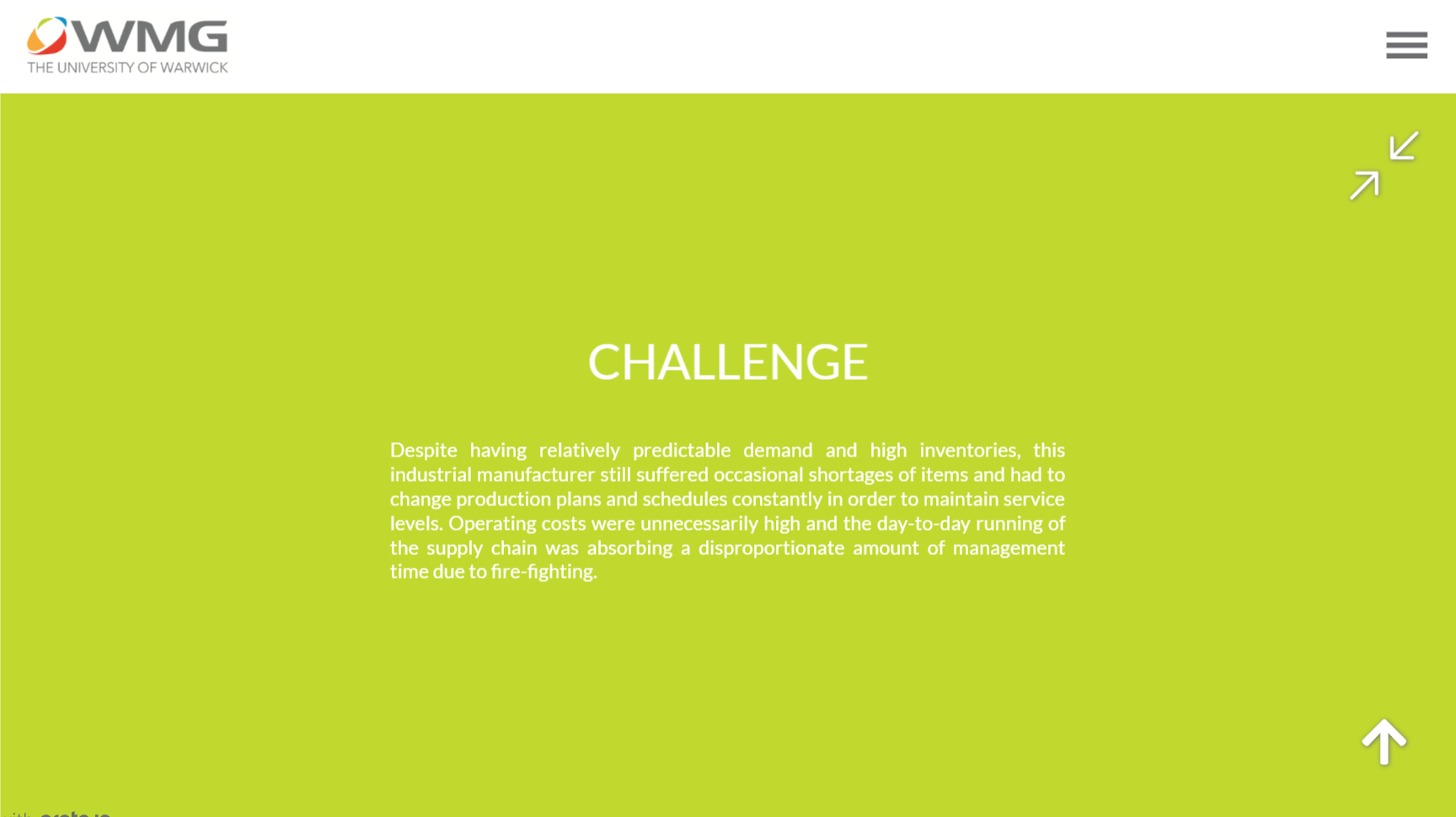
Challenge section of case study.

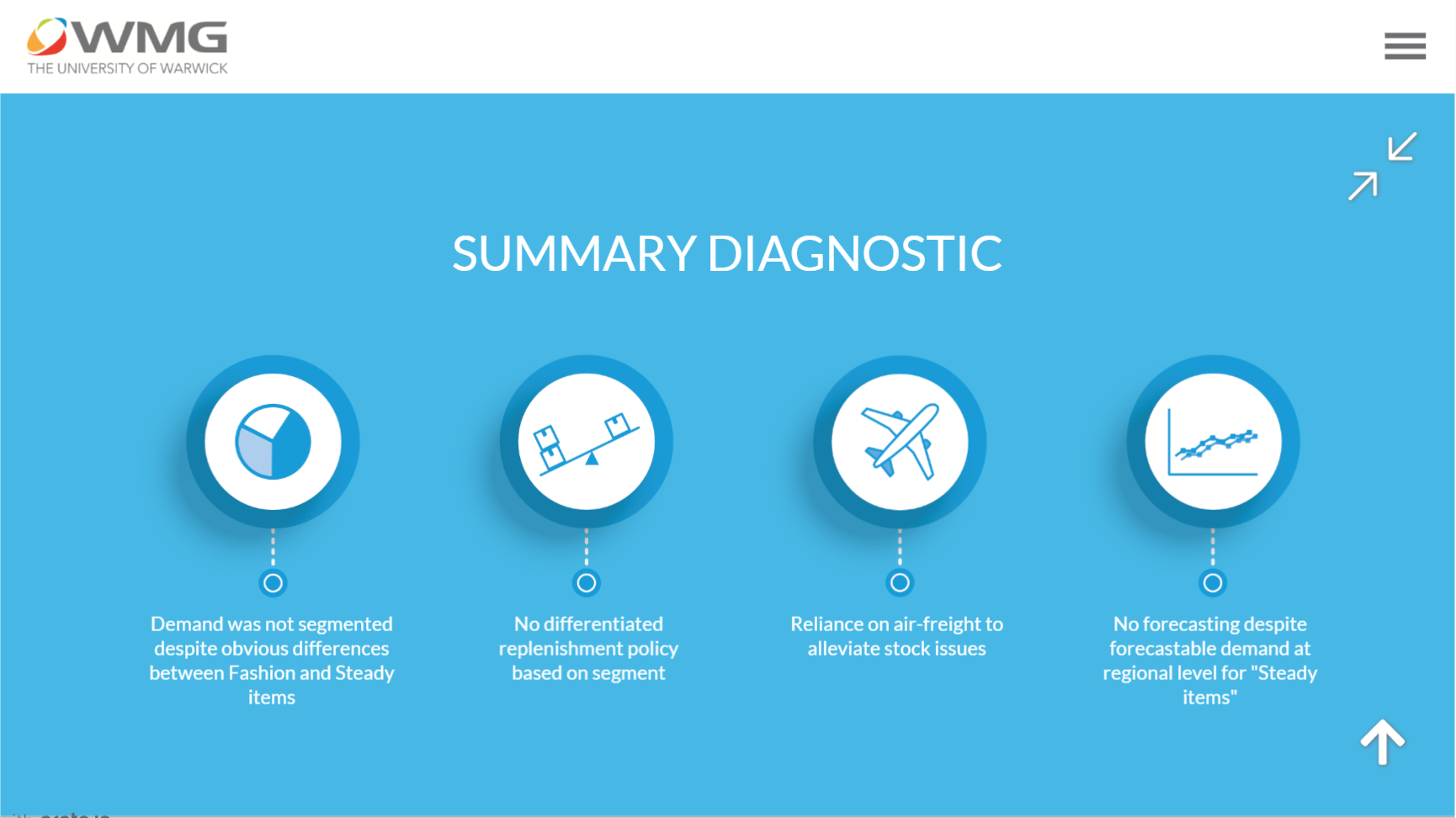
Summary diagnostic section of case study.

Overview of process assessments - clicking on any individual picture or the expansion arrows opens the relevant subpages.

Forecast process assessment full view - swiping left or right (or clicking on carousel bar at bottom) navigates to the other process assessments. The video (which autoplays) can be enlarged to be full screen.
Features
Touch-oriented navigation system
There was clear signposting (iconography, action words) of navigation possibilities, with an awareness that certain ‘typical’ interactions such as hover states are unavailable on touch screen. Multiple modalities for achieving most actions were available (for users of different technical abilities); for instance, to expand cards users can either tap the card itself or use the expanding arrows icon.
Rather than filling the whole 55’’ screen with text and images, visual media was prioritised for the largest elements. When longer text was required, it was presented in a small central area on a plain coloured background for ease of readability and to reduce distractions.
Maximising space
The home screen was designed as a moving carousel (6 seconds per image) to draw visitors’ attention to the screen, as well as to easily display the site pages that can be navigated to. The carousel indicator at the bottom of the home screen was used as a metaphor on subsequent screens to indicate when horizontal swipe actions were available.
Carousels for images
We decided to organise longer form content by following Campbell’s ‘hero journey’ template, a narrative device taking the reader on a journey from the initial challenge through to the final resolution. This has been shown to better tap into one’s emotions, increasing engagement and content retention.
Thematic storytelling
Results
Outcome: Feedback from stakeholders was overwhelmingly positive. I successfully handed off my prototype to the development team, and assisted them in testing the real system. I achieved my goal of deploying an accessible and informative display which engaged the interest of visitors. Though my internship was fixed term, I was contracted for a further month to design and launch the interface on mobile and desktop.
Lessons learned: The project enhanced my knowledge of user-centred design, and illustrated the importance of considering a range of user needs, rather than designing for a single set of skills and abilities. I learned that continuous interfacing with the tech team is imperative to ensure that proposed elements, such as animations, are indeed feasible within the constraints of the development engine (i.e. Wordpress).
