Grocery Store Website (Redesign)
University group project evaluating the usability of a fictional grocer's website against industry guidelines, in order to create a new website with an improved user experience.
Project Type
University Coursework for Social Informatics Module
Team
5 students
Duration
8 weeks
Role
I acted as the UX lead, identifying key usability issues in the site’s navigation before constructing an improved IA and user journey map. I led an ideation workshop to create whiteboard sketches for the new site, and tested the UX of the final design.
Old Website

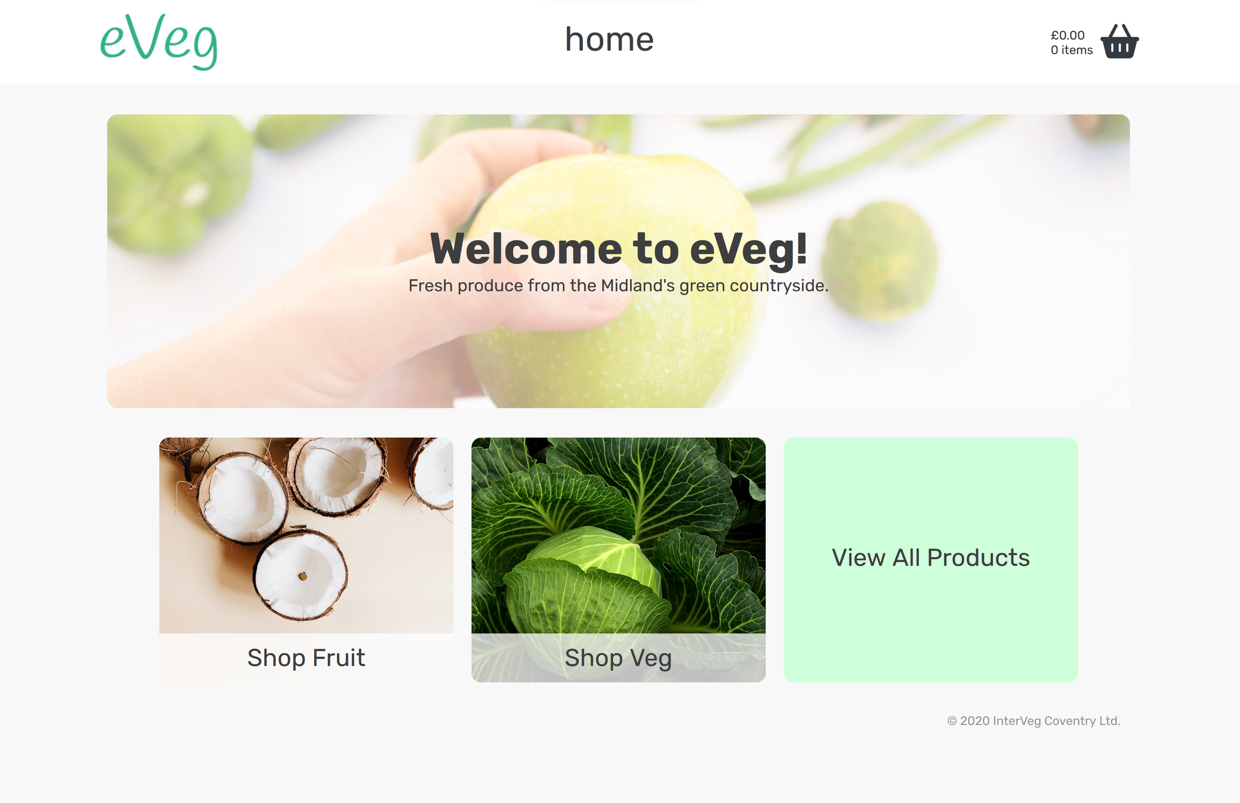
Old home screen

Old shop view

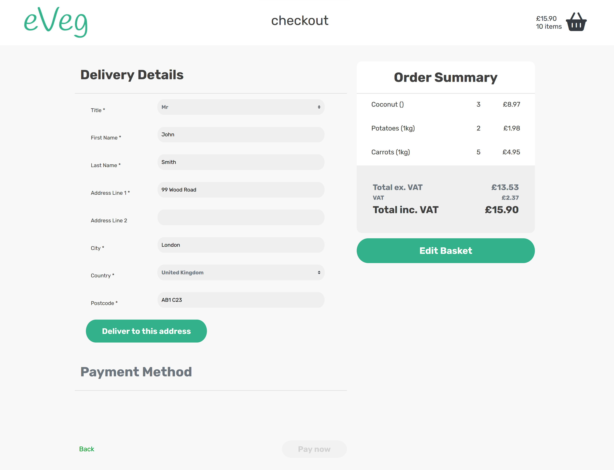
Old checkout screen
The Challenge
The overarching aim of the project was to improve the usability of a fictional grocer’s website, in response to users struggling to successfully purchase items from the site. The end-users were characterised as people who had a desire to purchase groceries online and had experience using online shopping for food in the past.
Key usability issues in the existing site included poor navigability: the website had multiple dead-ends and lacked a global navigation system, with users frequently getting lost in the site. Progressing from item search to the shopping basket was a particular pain point, as users were given no feedback on the success of actions such as adding or removing items from their baskets, and the checkout forms lacked validation mechanisms for user input. The original site was inaccessible to people with visual impairments, lacking appropriate text-to-background colour contrast and element descriptions for screen readers.
Technical constraints included having to work with the existing website’s back-end, and not being able to modify the source code. As such, the front-end redesign had to fit within the existing data model of the site. The business wanted a final prototype within three months, meaning that we needed to slim down our deliverable to a minimum viable product and omit any features deemed beyond the scope of the brief.
The Solution
Due to the poor site-wide usability, we decided to redevelop the UX from scratch. We conducted a cognitive walkthrough of the existing system to uncover the pain points users were likely to encounter and gather specific and actionable usability insights. I conducted a competitors’ analysis of existing grocery shopping websites, using the results to construct an ideal user journey map through the system, and illuminate the primary aims of our target users. I translated these high-level aims into a set of user-facing requirements categorised into core and optional, marking features as core only if they were integral to the brief provided by the business.
UX Research
Ideation
I conducted an open brainstorming session where we sketched out the UX for specific site features and use-cases, creating several designs in parallel and selecting those most likely to reduce cognitive load.
Our sketches were digitally rendered into low-fidelity, interactive prototypes, and subject to rapid cycles of formative evaluation and refinement within the team. Due to time and resource constraints, external users were only recruited at the later stages of the project to evaluate the overall user journey through the high-fidelity prototype.
New Website

New home screen

New shop view

New basket screen

New checkout screen (delivery)

New checkout screen (payment)
Features
We implemented a consistent navigation menu across all site pages and indicated the current page name, to help users orient themselves within the site.
Site-wide navigation
Improved shopping experience
In the shop page, we adopted a grid layout of items to effectively utilise screen real estate and added a filter feature to help users rapidly locate the desired item. We also implemented a basket preview, made visible by clicking on the icon in the navbar, to avoid the frustration of navigating between pages to check the basket.
Feedback and Error Prevention
Visual feedback was implemented for all interactions with items e.g., the basket icon ‘jumping’ when an item was added. Errors were prevented in the checkout through only showing buttons as clickable once all required information was entered and validated. Recoverability was achieved through dialogues asking users to confirm important actions such as emptying the basket.
Accessibility
The style guide included high-contrast colours and sans-serif fonts to aid users with low vision. All page elements were labelled, and image descriptions were provided.
Results
Our summative usability study suggested that our redesign was successful in ameliorating the problems identified in the original interface. Participants in the study:
Completed tasks on the redesigned website in a significantly shorter time than on the original website.
Made significantly fewer errors using the redesigned website.
Subjectively reported the redesigned website as easier to use, more aesthetically pleasing, and easier to navigate than the original.
Overall, I successfully led a redesign of the site UX in line with the project scope, and the identified needs of users. I worked with another designer to develop ideas in parallel and ensure the selected design best fit our requirements of clear navigation, visual minimalism, and accessibility. I made sure to keep all members of the team aware of my design decisions, and successfully handed over.
In the future, I would try to recruit screen-reader users to test the prototype fully to ensure that the accessibility features were implemented correctly.


