Building Accessibility into a Legal Website
Freelance UX/UI project redesigning a legal services’ website, in order to improve accessibility, usability, and branding.
Project Type
Freelance Project
Team
Myself + 2 founders
Duration
4 weeks (initial) + maintenance
Role
I acted as the sole UX/UI designer, identifying major accessibility and usability issues on the site before collaborating with the founders to establish new brand guidelines. I overhauled the UI for both web and mobile, as well as creating a flier to encourage sign-ups to the site.
The Challenge
The client, Balint Legal, was a newly established legal partnership providing Balint groups for the legal sector. Balint groups are professionally facilitated peer supervision and reflective practice groups. As a result, a usable website with a strong brand identity was integral to establishing an initial client base and growing the company. It was important to clearly communicate Balint’s services, and appeal to a broad range of legal professionals. The website needed to visually balance a modern feel with comfort and adopt a layout familiar to senior professionals.
However, the existing website did not meet the aesthetic requirements of the business and in addition was inaccesible to end users, from text and colour issues to image inconsistencies. These issues represented a key limitation to the site’s reach and SEO.
The main constraint of the project was that I needed to work within the existing Squarespace implementation due to budget and time, which limited how many features could be changed.
Accessibility Audit - Old Website
The old homepage of the Balint Legal website, featuring an unstoppable scrolling animation and incorrectly tagged HTML text elements.
No alt text on images - this is inaccessible for screen reader users
1 |
Pure black text on a pure white background - this causes eye strain
2 |
Centre and justified text for the body - this is less readable
3 |
Text in very long paragraphs - should be broken up for ease of reading
4 |
Inconsistent text sizing - headers to small to be readable, social links sized differently to each other
5 |
Continuous scrolling animation on homepage - inaccessible for people with vestibular issues, difficulties with concentration etc.
6 |
Insufficient colour contrast between text and background - optimal compliance is a contrast ratio of 7:1 for normal text and 4.5:1 for large or bold text for readability
7 |
Concealed links - use of click “here” requires the user to read around the link to understand its context, also should be a different colour and underlined for clarity
8 |
The Solution
I chose blue as the primary colour to convey professionalism and reflect Balint’s brand image. The colour scheme was adapted from a website which ensures sufficient colour contrast between background and text.
Page sections were differentiated using background colour, to clearly segment content.
New Colour Scheme
I chose a serif font for the headings to provide an old-school feeling, with sans-serif for the body with readibility in mind. Content was split into smaller paragraphs, with visual hierarchy (text size, bolding) utilised to emphasise important content.
The font sizes and heading levels were standardised sitewise for better consistency.
Font and Text Changes
With larger screen sizes in mind, I decided to present the majority of text in the middle 1/3 of the screen. Due to Squarespace’s dynamic resizing, these margins scale accordingly and smaller screens are moved to the mobile-friendly version (full width text).
Spacing was increased between images and above the footer to reduce content density.
Padding and Layout
The UX and branding of the site were iteratively evaluated with a network of prospective clients (mid-senior legal professionals), leading to improvements to the layouts of individual pages and the use of colour. A key difference in the final iteration was the selective use of images to ensure that they conveyed a specific idea or enhanced text content.
Continuous Improvement
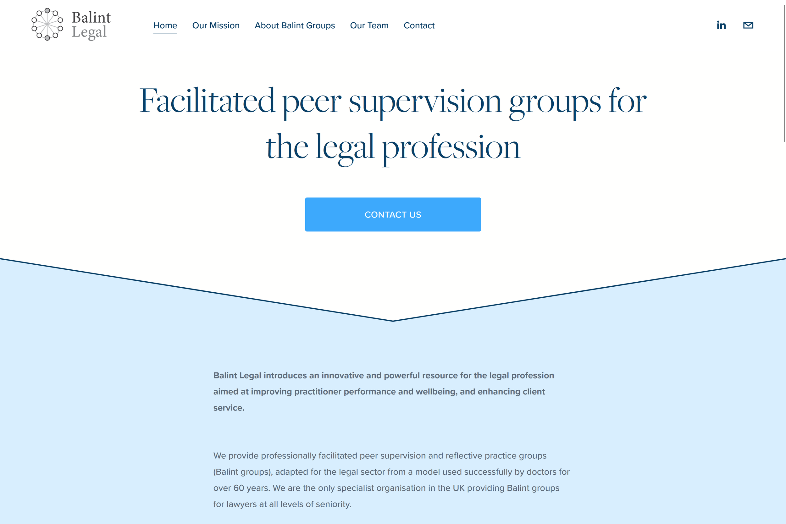
New Website

New home screen

"Our mission" page

Section of "our team" page

Section of "about balint groups" page

Section of "contact us" page
Accessibility Audit - New Website
(7) Overlay behind text to improve contrast
(8) Example of links on the new site
(1) Descriptive alt text on one of the icons
Alt text on all images - this is accessible for screen reader users
1 |
Text and background not in pure black / white - this reduces risk of eye strain
2 |
Left aligned text for the body - this is more readable than justified / centred text
3 |
Text broken up into shorter paragraphs - easier to read and digest
4 |
Headers and paragraphs sized appropriately - indicates information architecture to user
5 |
No continuous scrolling animation on homepage - accessible for people with vestibular issues, difficulties with concentration etc.
6 |
Sufficient colour contrast between text, background and images - easier to read for users with low vision
7 |
No concealed links - all links clearly explain where they direct to, and are signposted with an accent colour and underlining
8 |
Additional Work:
Company Flyer
After the website was completed, the client wanted me to create a flyer to encourage sign-ups to their pilot Balint groups.
This was created in Adobe Illustrator, using the same style guide as the website.
Results
Outcome: The accessiblity audit of the new website showed that my redesign successfully resolved the visual and information architecture issues of the old site. The client was highly satisfied with the new branding, and received feedback from their peers that the website was professional, clear, and advertised Balint Legal’s services effectively. Additionally, the company flyer successfully increased website conversions.
Lessons learned: Having primarily focused on UX design before this project, I developed a deeper appreciation of UI design, particularly around striking a balance between a professional output/brand image and my own personal styling preferences.


